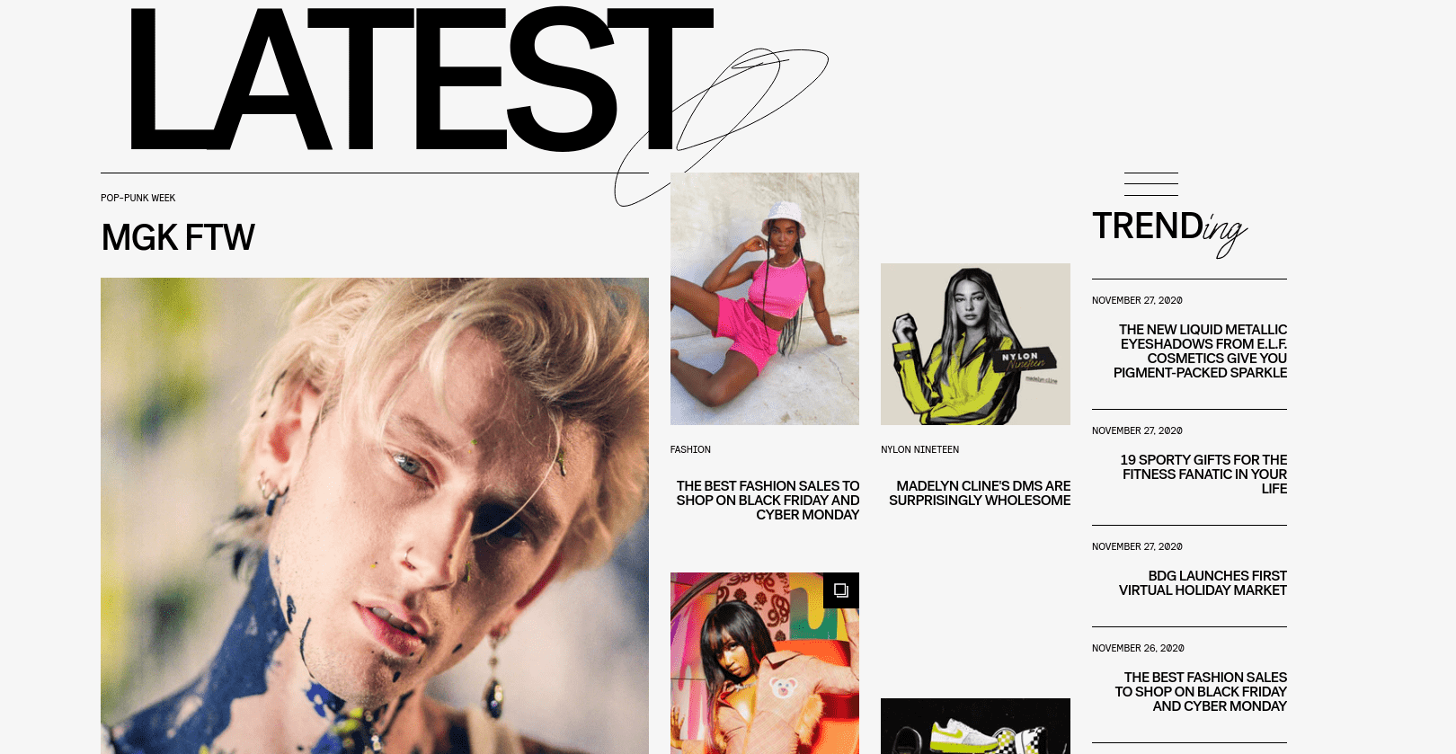
Block Architecture
A theme is composed of multiple theme 'blocks' stacked on top of each other and controls the organisation, features and style of a publisher's online newspaper. Block code is organised with a standard directory structure of files specific to Storipress themes, as well as supporting assets such as images, stylesheets, and scripts. To learn about about how themes fit into Storipress, and learn how to set up an environment to build and test themes, refer to the Storipress themes overview.
Anatomy of a Storipress theme block:
- Themes on Storipress are made up of modular 'blocks' stacked on top of one another.
- Blocks in Storipress are wrapped within a
Blockcomponent. - Blocks contain several
DeskSectionwrappers, which dynamically populate blocks with articles and stories. - Within a
DeskSection, severalArticleBlockcomponents can be nested. ArticleBlock components render the articles of our users within Storipress.
Here is an example of the basic structure of a Block:
<template>
  <Block :block="block">
    <DeskSection :order="0" v-slot="{ desk }">
      <h2>{{ desk }}</h2>
      <ArticleBlock v-slot="{ article }">
        <img :src="article.headline" />
        <h1>{{ article.title }}</h1>
        <p>{{ article.blurb }}</p>
      </ArticleBlock>
    </DeskSection>
  </Block>
</template>

<script>
// we use Typescript in our projects, but it's ok to use Javascript 😊
export default {
  props: {
    block: {
      type: Object,
    },
  },
}
</script>
Stylable Elements
Stylable elements within a block need to be marked. There are two types of stylable elements in Storipress: TextElement and TextInput.
TextElement: A stylable element. The font, size, and colour of the element can be changed within Storipress' website builder.TextInput: Here, not only can the style be modified in Storipress' builder, so can the content. This field is a text input field in our builder.
<template>
  <Block :block="block">
    <DeskSection :order="0" v-slot="{ desk }">
      <TextInput
        component="h2"
        kind="desk-title"
        :defaultValue="desk"
        :fontSize="{ xs: 28, md: 36 }"
        color="ff0000"
      >
        {{ desk }}
      </TextInput>
      <ArticleBlock v-slot="{ article }">
        <!-- You can style other element with css normally -->
        <img class="article-headline" :src="article.headline" />
        <TextElement
          component="h1"
          kind="article-title"
          :fontSize="{ xs: 28, md: 36 }"
        >
          {{ article.title }}
        </TextElement>
        <TextElement component="p" kind="article-blurb">{{
          article.blurb
        }}</TextElement>
      </ArticleBlock>
    </DeskSection>
  </Block>
</template>

<script>
export default {
  props: {
    block: {
      type: Object,
    },
  },
}
</script>

<!-- You must scope your css or use css module -->
<!-- You should use `scss` -->
<style lang="scss" scope>
.article-headline {
  /* `@apply` is provided by tailwindcss. We highly recommend you to use tailwindcss in style or in the template */
  @apply w-64;
}
</style>
TextInput
is used. Here, we will make the title of a
desk
editable with
TextInput
, with the article title and article blurb being stylable using
TextElement
The LinkElement Component
To add a link (an a tag in html), you can use the LinkElement component
<template>
  <LinkElement href="https://example.com">link</Link>
</template>
Placeholder Images
Provide placeholder images in your blocks so that when previewed in the builder it looks nice. A great service for license-free images is Lorem Picsum (we use this internally)
Adding Foo Data
If you want to fill your block with some text, try out this fake headline generator.
CSS Unit Rules
Storipress adds padding around your Block. Only use % on container divs.
Validate your HTML
As Storipress uses Server Side Rendering (SSR), the browser will automatically normalize your HTML. This means the client side HTML will be different to the server side which may have some unintended effects. You can use the HTML Validator extension to check your HTML.
Here are some common pitfalls:
<p>
  <div />
</p>
div
within
p
does not work
<a>
  <a />
</a>
a
/
LinkElement
within
a
/
LinkElement
also does not work
Desks & Articles: FAQ
-
What is an Article & what is a Desk?
A desk is a collection of articles; and each article must belong to a desk. When a DeskSection is added, Storipress allows the user to choose a desk to populate the DeskSection with specific articles
-
When should I add a
DeskSection?
You will need a least one DeskSection to show an article. Additional DeskSections can be added when needed, e.g. the below example where "LATEST" and "TRENDing" would be two separate 'desks' in Storipress
