Components
Components allows you to give non-technical users an extra layer of customisability in your blocks, allowing them to change things like font, text, and background colors. Components also include a host of utility functions like breakpoints.
<TextElement>
TextElement
allows the user to style the text in the builder
Example:
<template>
  <TextElement
    component="h1"
    kind="article-title"
    :fontSize="{ xs: 28, md: 36 }"
    color="ff0000"
  >
    Article Title
  </TextElement>
</template>
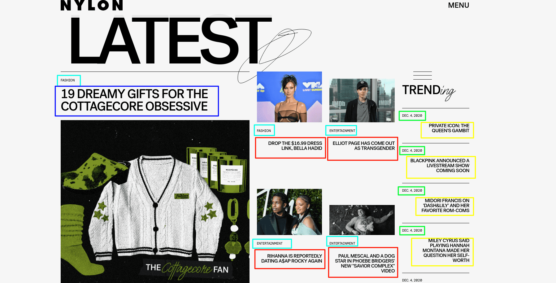
What is kind?
In Storipress, the elements with the same 'purpose' share the same styles. The kind property groups elements together so that styles can be shared.
The photo below provides examples of this. You will need to assign the same kind to all elements which have the same colour rectangle border, and use different kind on the elements with different colour borders.
| Props | Type | Default | Description |
|---|---|---|---|
| fontSize | number | 16 | font size (valid range: 8 ~ 280) |
| fontFamily | string | Jost | The font family |
| bold | boolean | false | is bold (font-width: 700) |
| italic | boolean | false | is italic (font-style: italic) |
| underline | boolean | false | is underline (text-decoration: underline) |
| uppercase | boolean | false | is uppercase (text-transform: uppercase) |
| lowercase | boolean | false | is lowercase (text-transform: lowercase) |
| align | string | left | text align (valid value are: left, center, right) |
| color | string | 000000 | text color, should be hex string like ff0000 |
| lineHeight | number | 1.5 | line height (valid range: 1.0 ~ 2.0 step 0.1) |
| hoverColor | string | N/A | text color in hover state |
Requirements for Styling Props
As Storipress extracts default values from your source code, you need to include styling values in your block:
<template>
  <TextElement :fontSize="{ xs: 36 }"></TextElement>
</template>
<template>
  <TextElement :fontSize="elementFontSize"></TextElement>
</template>
<script>
export default {
  data() {
    return {
      elementFontSize: { xs: 36 },
    },
  },
}
</script>
<TextInput>
TextElement
,
TextInput
allows users to enter arbitrary values.
Example:
<template>
  <TextInput
    component="h1"
    kind="desk-title"
    :fontSize="{ xs: 28, md: 36 }"
    color="ff0000"
    defaultValue="Lorem"
  />
</template>
| Props | Type | Mandatory? | Description |
|---|---|---|---|
defaultValue | string | ✅ | The default content for the element. |
The TextInput does not have any slots
Breakpoints
Storipress has 3 breakpoints:
| Breakpoint | Description |
|---|---|
xs | default value |
md | min-width: < 768px |
lg | min-width: < 1070px |
| slots | Description |
|---|---|
| Default | The content |
<LinkElement>
LinkElement
is a simple component which replaces the HTML
a
tag. This layer of abstraction allows Storipress to easily swap the
a
tag.
Use this element whenever a
a tag is required
Examples:
<template>
  <LinkElement href="https://example.com">link</LinkElement>
</template>
// You can use it with TextElement too!
<template>
  <LinkElement href="https://example.com">
    <TextElement kind="article-title" component="h2"> Title </TextElement>
  </LinkElement>
</template>
| Props | Type | Mandatory? | Description |
|---|---|---|---|
href | string | ✅ | The link target, same as a HTML a href |
| slots | Description |
|---|---|
| Default | The content |
<ColorArea>
ColorArea
is a stylable component allowing the user to change the background colour of a block within Storipress. This component should be used when a block has multiple background colors.
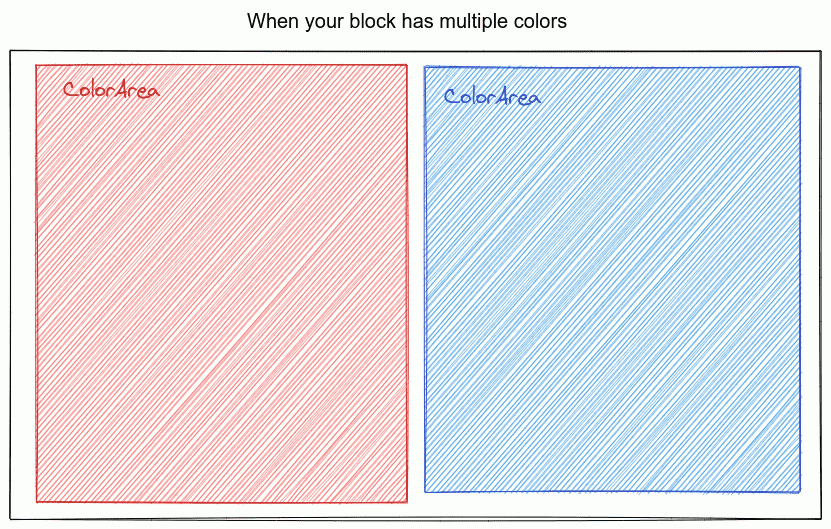
Example:
<template>
  <Block :block="block">
    <ColorArea backgroundColor="ff0000">
      <!-- content -->
    </ColorArea>
    <ColorArea backgroundColor="00ff00">
      <!-- content -->
    </ColorArea>
  </Block>
</template>
| Props | Type | Mandatory? | Description |
|---|---|---|---|
kind | string | ✅ | All elements with same kind will share styles. This must be a valid css class name |
backgroundColor | string | ✅ | The color hex code without the # prefix. It also supports object form for responsive config |
| slots | Description |
|---|---|
| Default | The content |
<ResponsiveImage>
ResponsiveImage
optimises images by resizing them on the fly (potentially improving site load speeds by 10x). This component can be used anywhere as an
img
replacement.
Example:
<template>
  <ArticleBlock v-slot="{ article }">
    <ResponsiveImage
      :src="article.headline"
      :alt="article.headlineAlt"
      sizes="(max-width: 768px) 95vw, 50vw"
    />
  </ArticleBlock>
</template>
| Props | Type | Mandatory? | Description | Default |
|---|---|---|---|---|
src | string | ✅ | Image url | N/A |
alt | string | ❌ | Image alt text (for SEO) | N/A |
width | string, number or array | ❌ | Used to generate srcset config; e.g. 370 → https://domain/path/to/img 370w. It can be: a single number (e.g. 300) when your image is fixed in size, an array of numbers or strings (e.g. 375, 768), or a comma separated string (e.g. 300,600) | [375, 750, 1200, 1600, 1920] |
sizes | string | ❌ | Used to configure how much space your image takes on screen. Using this, your browser will understand how to pick a correct size image. MDN Docs | [95vw] |
ratio | string | ❌ | Image aspect ratio. You can use this to force the image aspect ratio. e.g. 16:9, 1:1 | N/A |
<Spacing>
Spacing
component applies width restrictions to a block. All blocks will be automatically wrapped within this component, so in nearly all cases, this component will not be used.
One of the use cases this component is when two or more areas in a block require the width restriction set in a Hero Block's
SpacingProvider
Example:
<template>
  <HeroBlock :block="block">
    <SpacingProvider>
      <!-- content -->
    </SpacingProvider>
    <!-- content -->
    <Spacing>
      <!-- content -->
    </Spacing>
  </HeroBlock>
</template>
| slots | Description |
|---|---|
| Default | The content |
<Authors>
Example:
<template>
  <Block :block="block">
    <DeskSection :order="0">
      <ArticleBlock v-slot="{ article }">
        By <Authors :authors="article.authors" />
      </ArticleBlock>
    </DeskSection>
  </Block>
</template>
[1st author], [2nd authors] ... and [last author]
. This is the default style of this component.
| Props | Type | Mandatory? | Description |
|---|---|---|---|
authors | array | ✅ | Image url |
separator | string | ❌ | The separator between the author names. Default: , |
authorClass | string, number or array | ❌ | Use this if you want to add extra class to author name |
separatorClass | string | ❌ | Use this if you want to add extra class to separator |